FontAwesome is an incredibly useful tool for web design and we use it extensively to avoid the need to get icons designed on a regular basis. As such it is a key part of linkalist on the web and we provide extensive support for FontAwesome icon styles.

So now that we’re working on our iOS SDK, we have a similar need for graphical assets which are pretty tedious to build since we need to get an image into the system, scale it at three different sizes and then add it into the application. Then if we need to change the button size, we’ve go to do the whole thing again. The immediate driver of this was for an image selection control so that we could add camera and library buttons.
So this morning I decided that I’d wasted enough time messing about with this and decided to see about designing a FontAwesome button. As with most things in iOS this turned out to be a little more complex than necessary. First things first, I had to download the package from http://www.fontawesome.com . I’ve gone with version 5.6.3 but any version should work just as well.
Installation & Registration
I located all three of the ttf files in the webfonts directory of the download package and installed them onto my system. Then I added the three ttf files to my application resources.
The next step is to register the fonts. There is supposed to be a way to do this using the info.plist file but this is somewhat unreliable and I find it simpler to do this in code.
extension UIFont
{
  class func loadAllFonts() {
    let bundleID = "io.linkalist.linkalistSDK"
    registerFont("fa-regular-400.ttf", bundleID: bundleID)
    registerFont("fa-solid-900.ttf", bundleID: bundleID)
    registerFont("fa-brands-400.ttf", bundleID: bundleID)
  }

  static func registerFont(_ fileName: String, bundleID: String) {
    if let frameworkBundle = Bundle(identifier: bundleID) {
      let pathForResourceString = frameworkBundle.path(forResource: fileName, ofType: nil)
      let fontData = NSData(contentsOfFile: pathForResourceString!)
      let dataProvider = CGDataProvider(data: fontData!)
      let fontRef = CGFont(dataProvider!)
      var errorRef: Unmanaged<CFError>? = nil

      if (CTFontManagerRegisterGraphicsFont(fontRef!, &errorRef) == false) {
        print("Failed to register font - register graphics font failed - this font may have already been registered in the main bundle.")
      }
    }
    else {
      print("Failed to register font - bundle identifier invalid.")
    }
  }
}
Now, calling UIFont.loadAllFonts should get the three required fonts registered. If you’re using an embedded framework make sure that the font files and this code are registered to the correct module.
I also find it convenient to make the various fonts accessible through functions in an extension to UIFont so that we can repeatably instantiate any of the three registered fonts at the correct size.
//Fonts
public extension UIFont
{
  public class func regularIconFont(size: CGFloat) -> UIFont
  {
    var font = systemFont(ofSize: size)
    if let iconFont = UIFont(name:"Font Awesome 5 Free", size: size)
    {
      font = iconFont
    }
    return font
  }

  public class func solidIconFont(size: CGFloat) -> UIFont
  {
    var font = systemFont(ofSize: size)
    if let iconFont = UIFont(name:"FontAwesome5FreeSolid", size: size)
    {
      font = iconFont
    }
    return font
  }

  public class func brandIconFont(size: CGFloat) -> UIFont
  {
    var font = systemFont(ofSize: size)
    if let iconFont = UIFont(name:"Font Awesome 5 Brands", size: size)
    {
      font = iconFont
    }
    return font
  }
}
Now we have the various fonts easily accessible at any required size.
Implementing the Control
Finally, we get down to the business end of the control. Since, I’d like the option of rectangular, circular and roundrect buttons, I’ve defined an enum to allow me have those three shapes, along a corner radius that only gets used on RoundRects. Finally, since I also like borders on buttons, I’ve allowed the option of specifying the border width in pixels. The colour is the same as the text colour to keep things nice and clean.
Since we have three font styles, we need another enum for that and also a size value exposed as an inspectable. This size represents the font size as a percentage of the button size which is convenient for this application.
//  FontAwesomeIconButton.swift
//  linkalistSDK
//
//  Created by James Howard on 01/03/2019.
//  Copyright © 2019 Linkalist Technologies. All rights reserved.

import UIKit

class FontAwesomeIconButton: UIButton
{
  enum BackgroundShape: String
  {
    case Rectangle = "Rectangle"
    case RoundRectangle = "Round Rectangle"
    case Circle = "Circle"
  }

  enum FontStyle: String
  {
    case Regular = "Regular"
    case Solid = "Solid"
    case Brand = "Brand"
  }

  @IBInspectable var shapeName: String {
    get {
      return self.buttonShape.rawValue
    }
    set( shapeIndex) {
      self.buttonShape = BackgroundShape(rawValue: shapeIndex) ?? .Rectangle

      drawBackground()
    }
  }
  @IBInspectable var cornerRadius: CGFloat
    {
    get {
      return buttonCornerRadius
    }
    set (value)
    {
      buttonCornerRadius = value
      drawBackground()
    }
  }


  @IBInspectable var fontStyle: String
    {
    get
    {
      return self.buttonFontStyle.rawValue
    }
    set (fontIndex)
    {
      self.buttonFontStyle = FontStyle(rawValue: fontIndex) ?? .Regular
      setupFont()
    }
  }

  @IBInspectable var fontSize: CGFloat
    {
    get {
      return buttonFontSize
    }
    set (value)
    {
      buttonFontSize = value
      setupFont()
    }
  }

  @IBInspectable var borderSize: CGFloat
    {
    get {
      return buttonBorderSize
    }
    set (value)
    {
      buttonBorderSize = value
      setBorder()
    }
  }

  var buttonShape: BackgroundShape = .Rectangle
  var buttonFontStyle: FontStyle = .Regular
  var buttonFontSize: CGFloat = 50.0
  var buttonBorderSize: CGFloat = 0.0
  var buttonCornerRadius: CGFloat = 0.0

  func setupFont()
  {
    let fontSize = (bounds.size.height * buttonFontSize ) / 100.0

    switch(buttonFontStyle)
    {
    case .Regular:
      self.titleLabel?.font = UIFont.regularIconFont(size: fontSize)
    case .Solid:
      self.titleLabel?.font = UIFont.solidIconFont(size: fontSize)
    case .Brand:
      self.titleLabel?.font = UIFont.brandIconFont(size: fontSize)
    }
  }

  func drawBackground()
  {
    if(buttonShape == .Circle)
    {
      var minSize = bounds.size.width;
      if bounds.size.height < minSize
      {
        minSize = bounds.size.height
      }
      self.layer.cornerRadius = 0.5 * minSize
    }
    else if(.RoundRectangle == buttonShape)
    {
      self.layer.cornerRadius = cornerRadius
    }
    self.clipsToBounds = true
  }

  func setBorder()
  {
    self.layer.borderWidth = borderSize
    self.layer.borderColor = self.titleLabel?.textColor.cgColor
  }
}
Once you’ve added this to your project, you should now be able to create FontAwesomeIconButton controls by adding UIButtons to any view and then changing the class to FontAwesomeIconButton. This should expose the properties below.
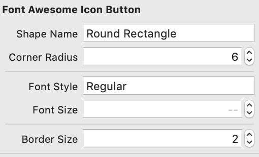
For all of the other usual properties of button such as text colour, background colour, shadow, etc., you can access these from the UIButton design features. To specify the icon you require, just find the icon on the fontawesome.com page, copy it and paste it into the text area in InterfaceBuilder. It might look a little weird in the panel but if you have the fonts correctly installed, it should preview and render correctly in your app.
This was a bit of a detour off the path of our core offering but it should be one with quite a short payback time. It typically takes about 30 minutes to an hour to get an icon designed cleanly and consistently with the app theme. But by using FontAwesome icons and code to do this we can get a more consistent result in just a couple of minutes’ work.
So that’s about it on how we’ve gone about adding a nice quick way of setting up a button from a FontAwesome icon. Feel free to use the code here to build this yourself, sign up below to get access to this and loads of other great features to simplify your application development.