Now that we’re working on putting together a consumer application with linkalist, it’s become apparent that we need some nicer ways of presenting some data entry controls as the existing palette is just a bit boring.
Object Selections
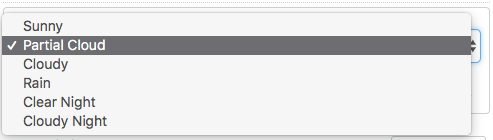
The first area of improvement is among object selections where as it was, you could have anything you want so long as that was a drop-down selection. This works OK but is not terribly exciting and has relatively poor usability on mobile.
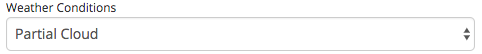
So our first improvement is to add a new setting to the item view definition to allow use to define the selection style and allow for the use of a button group as a style. These are a standard feature of many bootstrap web applications and work much better on mobile devices than the drop-down selects.
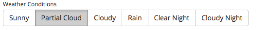
To add a bit more visual punch, we also added in the ability to be able to specify an icon for each option. We can use the standard font-awesome icons but as our example application needs weather features we also integrated an excellent weather icons project that works exactly the same as font-awesome. This gives us a nicer look and feel.

Our final improvement was to add another option to enable traditional radio buttons. Although, we believe that button groups provide better usability, people are used to radio buttons and some people might prefer to offer these.

Number Sliders
In some cases, it’s nice to be able to pick a number from within a range using a slider. So, we’ve added this as an option for number entry.

Sliders need a minimum, a maximum and optionally a step value. They provide a nicer look and feel and improved usability if used appropriately.
Advanced Sliders
I wasn’t quite happy with the basic html slider so I wanted to find a better looking option. I had a good look around and came up with the ionden RangeSlider as a good solution. This offers a lot more functionality that what is strictly necessary as it allows the entry of a range of data, but we can use the basic features to provide a nicer-looking and more usable slider.
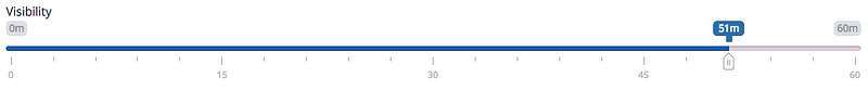
The configuration of this control is quite complex as it has quite a few settings but the more complex settings are handled by the addition of a new control configuration panel on the View Columns and Item View setup. This allows specific control settings to be defined using JSON options that are parsed into the Javascript configuration for the control. For now this option is only applied to the advanced slider.
Note that when using examples off the ionden website, you’ll need to use quotes around the keys to form valid JSON — the ionden examples are Javascript rather than JSON.
{
   "grid": true,
   "postfix": "m"
}