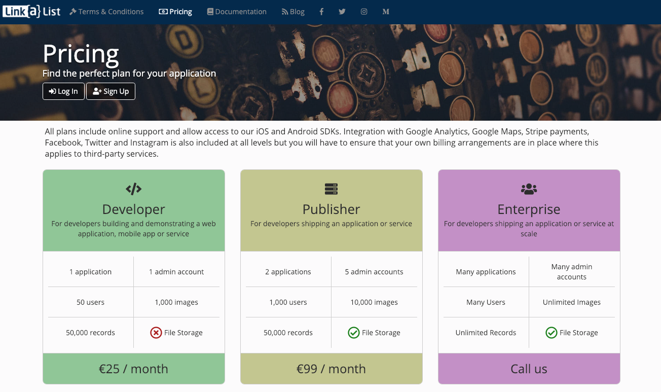
Getting your pricing page looking well is an important detail on your application or service’s landing page. With tiered services, there is often quite a difficulty in presenting the information required to decide on which tier you need and the resulting page often ends up a confusing mess.
This was certainly the case on our older pricing page, but hopefully we’ve banished this with the newer version. This is very much a version 1.0 of our own pricing as we’ll definitely need to refine this as we go but the same template is available for our customers to use for their own pricing page.

Our next step with this is to work towards integrating our Stripe payments functionality so that both our customers and those of our partners will be able to sign up directly and use Stripe’s functionality to manage free trials and their billing relationship.
Once the technical work was completed for a pricing page, we have to figure out some price points that work for both us and our customers. We’ve gone with two rates — a developer plan that should allow a single developer to put an application together at a price point she can bear personally and a more expensive plan suitable for the early growth phase of a production app. At this point, we don’t have enough information on the costs to put together a plan for a bigger customer so we’ll leave this one open for now.